Mobile demand is growing rapidly, and in 2021 there are more mobile phones than humans living on the planet. By using responsive design (RWD), your website can look great regardless of the device your customers use to view it.
In terms of web development, responsive web design (RWD) means changing the appearance of a website dynamically based on the size and orientation of the device being used to view it. RWD designs websites to work across different devices, such as smartphones and large desktop monitors.
With responsive web design, sites can be tailored to provide the best possible viewing experience across an array of devices with the least amount of resizing, panning, and scrolling. Most notably, this practice involves flexible grids and fluid images.
Using RWD saves time and money on complex projects, and is a particularly good solution for sites that range in complexity from medium to large, due to the number of elements and page templates they contain. The RWD technique solves the problem that media queries do not work on very old browsers.
A number of different frameworks are available for building responsive, mobile-friendly websites. One of the most versatile is Bootstrap from Twitter. A collection of HTML and CSS templates, Bootstrap allows you to easily build single page websites with a fluid layout that works on any size device.
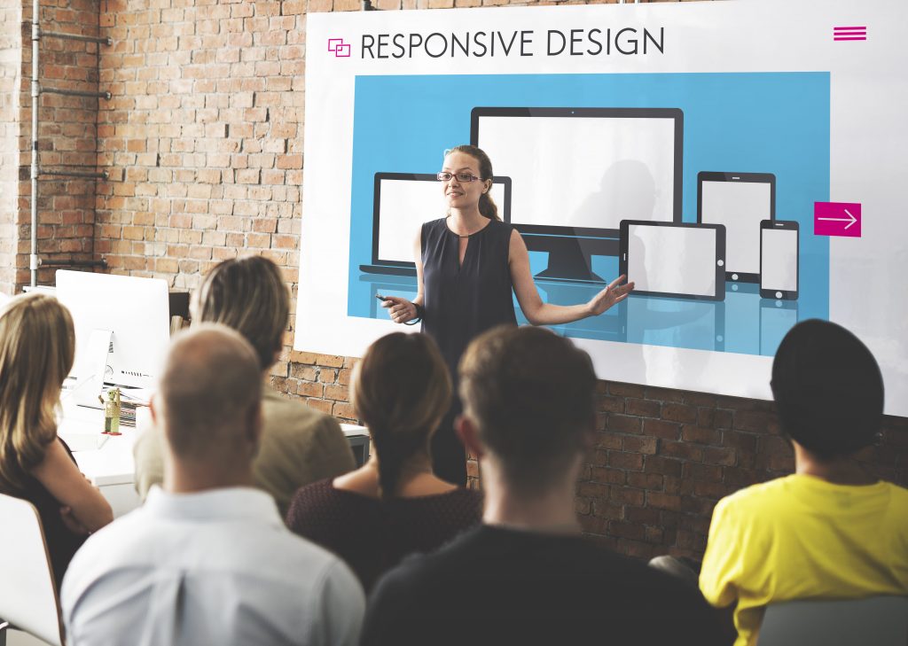
How Does A Responsive Website Works?
Fluid grids were the most popular way of making websites curvy at the beginning of responsive web design. Today, you can build fluid responsive websites with CSS media queries and modular grids that enable many new features not possible previously.
In order for responsive design to work, three principles need to be applied. Other principles play a part in certain designs as well, but these three principles are the ones that are common to all responsive sites – Fluid Grid Systems, Fluid Image Use, Media Queries.
Responsive web design requires Cascading Style Sheets (CSS) which use various style settings per screen size (orientation, resolution, color capability, etc.) to serve different styles to a user. Two examples of CSS properties related to responsive web design.
Responsive sites are designed to work on any size screen and device, from the biggest desktops to the smallest smartphones. Responsive sites adapt themselves automatically to fit different screen sizes and resolutions instead of creating different layouts.
The best thing about building a responsive website is that you will be able to serve your content to everyone, regardless of which device they are using or how big their screen size is. That means there is no need to create different versions of your site.
What Is A Responsive Framework?
Frameworks are packages that tend to contain standardized code in the world of web design. It is possible to use this code to develop websites. For the construction of a site, it serves as the foundation.
The framework provides developers with tools and resources they need to build a website. Frameworks are available for many languages and platforms. Package of standardized code (HTML, CSS, JS) which enables the development of websites, and is used as a basis for the development of a website.
Frameworks are designed to provide a common structure so their developers don’t have to reinvent the wheel and can reuse their existing code. By reducing the work and saving us time, frameworks help us cut out the majority of the work.
It can be divided into backend and frontend. The frontend is the part of the website users can see and interact with such as the GUI and the command line. The backend of a website, however, is invisible to users.
Despite their differences, websites generally follow a similar structure. In other words, frameworks let developers leverage the code rather than having to start from scratch with new designs. In turn, developers can save both time and effort when it comes to creating web elements.
What Is A Lightbox In Web Design?
Lightbox creates an image or video display that fills the screen and dims the rest of the web page. Most commonly it is used as a photo gallery viewer, but it also works well with other content. Nothing beats a lightbox when it comes to presentation of images and videos.
With a lightbox, you can control how images that might be too wide to fit with text are displayed. Responsive web design makes the website content look good on any device: mobile, tablet or desktop computer. A website that is responsive is easy for users to read and browse from different devices.
There are many ways to use lightboxes for your site; they can be used to introduce new products or promotions, or to share a certain image or video with users or even gather potential customers’ email addresses – a critical step for email marketing.
There are many types of lightboxes, ranging from those with a combination of images and text to those with text only on a plain background. Promotion Lightbox, Mobile Lightbox, Cookies Lightbox and Email Lightbox are a few types of lightboxes.
Content intended for the lightbox should encourage customers to stay on your site and help them take action. Start by looking at what you want visitors to do and think about how a call to action could best serve that purpose.
What Is The Purpose Of Responsive Web Design?
Responsive design can help you solve a lot of problems for your website. It will improve how your site looks on mobile devices as well as on large and small screens, thereby increasing how long your visitors remain on your site. It can also help you improve your rankings in search engines.
A multiscreen society is the norm today. In order to ensure that your content can be accessed across a wide range of devices, your website needs to be mobile responsive. Websites built according to responsive design can adapt to the size of the device they are being viewed on.
You can provide a better user experience to your customers with responsive websites. The content can be viewed thoroughly and quickly without the need to zoom in and out for viewing, and the overall impression of visitors will be a very positive one.
If your website is built with responsive design, you will be able to make changes quickly and easily. There will be no need to make adjustments to two different websites. A huge advantage of this is the ability to make quick changes to designs or to deal with typographical errors.
Responsive design offers a practical way to avoid the cost of a mobile site by preventing the use of a mobile-friendly site. It will only be necessary to dedicate investment to one site design to cater to all visitors and devices.